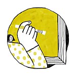
**ROUGH**
Almost intuitively chose "ROUGH" as the main axis
Roughness, ruggedness, roughness, difficulty, and savagery in the interpretation of words fit the author's unmodified and exposed self-entanglement in writing
Based on this concept, the Rough spirit is reflected in the design of the frame
**Writer**
Yan Lijie
**Binding Design**
Tsao Wen Zee
**Size/zine**
395x460mm
**paper**
Advanced Vitality Paper, Riso Paper, Kraft Paper
**print**
Retro printing jam, Roumei photocopying company
**set**
Zine+Poster
**Size/poster**
395x460mm
**paper**
black kraft paper
**The poster will be sent at 20% discount, not the whole sheet.**
https://live.staticflickr.com/65535/51700498394_b0f7fb033c_b.jpg
**plan the details_______________________________________________________**
https://live.staticflickr.com/65535/51700087328_9a0a50e8a5_b.jpg
**the cover**
Use sandpaper to make ROUGH tactile, the title of the book is written in Silver ink on the woven label on the side, the woven label is made of hand-dyed ink blue cloth, and the edge is left unlined
https://live.staticflickr.com/65535/51699017412_967054fa69_b.jpg
**the paper**
Retro paper with rough touch and low chroma builds up the overall achromatic tone
For some pages, select Vimotic paper with high light transmittance and fine texture
Slightly revealing afterimages of the next page, such as the imprint of thoughts and words drifting in the mind
https://live.staticflickr.com/65535/51700491384_0d9ee00200_b.jpg
**Rhythm layout**
Turning over the cover of the book, there are many noise-like pages, symbolizing the fragments that the author must experience before writing
Then enter the text page, and as the reading progresses, more and more blank pages are interspersed, symbolizing self-doubt, the emptiness of no one talking, and the expectation of continuing to write
https://live.staticflickr.com/65535/51699021087_1a2c749301_b.jpg
**text page**
After the text is finalized, use various manual destruction (brushing, washing...) to wash out the human texture from the computer typesetting and machine output fonts
Separate use of toner copy and Risograph for a unique low-res feel to details
https://live.staticflickr.com/65535/51700098873_7cb018402d_b.jpg
**author page**
The author doesn't like formal self-introduction, so it is included in the book by inserting pages. Manually tear out the coarse fibers of kraft paper, more lively and more beautiful
Product Description
Product Details
- Material
- Paper
- How It's Made
- Handmade
- Where It's Made
- Taiwan
- Stock
- Down to the last 6
- Ranking
- No.123,930 - Stationery | No.2,490 - Indie Press
- Popularity
-
- 2,079 views
- 4 sold
- 16 have saved this item
- Product Type
- Original Design
- Listing Summary
- Yan Lijie's first collection of texts Cottage text binding design
Shipping Fees and More
- Shipping
- Payment method
-
- Credit/debit card payment
- Alipay
- Refunds & Exchanges
- Read more about refunds and exchanges
- Report
- Report this item


