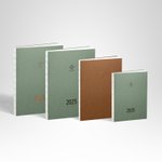
**●High-Quality Paper for a Smooth Writing Experience**
The pages are made with 68g/㎡ white Japanese Tomoe River Paper and feature a lay-flat binding design, allowing the planner to open completely to 180 degrees.
**●Weekly Plan with Color and Line Design to Segment Time**
The two-page weekly planner uses color variations and line thickness to segment daily time, replacing the traditional hourly timeline.
**●Grid Design Without Intervals for Increased Writing Space**
The bottom of each page is covered with a very faint grid. The interval-free grid design removes frame constraints, providing more writing space.
**●TAKE A NOTE's Functional Grid Design for Easy Writing**
TAKE A NOTE's signature functional grid design cleverly uses varying line depths and positioning points, allowing users to quickly see the page structure and find their preferred writing spots.
﹌﹌﹌﹌﹌﹌﹌﹌﹌﹌﹌
**<FEATURE>**
https://live.staticflickr.com/65535/53955912108_d70deaa6ee_c.jpg
**#1 SMALLER IN SIZE, LIGHTER IN WEIGHT, AND MORE SPACES**
"MEDIUM WEEKS" is in B6 size with a page bottom filled with very light-colored grids. The grid design without any spacing breaks free from the constraints of traditional formats, providing additional writing space. The two-page-per-week weekly plan allocates more pages for grid note-taking, addressing the long-awaited demand from users for more blank pages.
https://live.staticflickr.com/65535/53955890598_d9dba77935_o_d.jpg
**#2 NEW DESIGN WITH HIGHER FLEXIBILITY**
The two-page-per-week weekly plan employs variations in color intensity and line thickness to segment daily time, replacing the conventional hourly-based timeline. The same space can be customized according to personal preferences, catering to users with lower demands for time management while not affecting those who require schedule organization.
https://live.staticflickr.com/65535/53956120865_64ef5bcee2_o_d.jpg
**#3 INNOVATIVE GRID DESIGN FOR BETTER WRITING**
Continuing the innovative grid design from the RECORD series, we ingeniously utilize variations in line intensity, shading, and positioning points. This eliminates the need to spend time counting grids, as our design allows users to instantly grasp the page structure and easily locate their preferred writing positions.
﹌﹌﹌﹌﹌﹌﹌﹌﹌﹌﹌
SPECIAL GIFT: Letterpress calendar bookmark
https://live.staticflickr.com/65535/53956123945_2a19a60e2e_c_d.jpg
**<CONTENTS>**
https://live.staticflickr.com/65535/53955963009_3dda574a86_o_d.jpg
**【YEARLY CALENDAR】**
Overview of the 2025 yearly calendar, featuring a dual-color design to distinguish between working days and holidays.
**【HABIT TRACKING / HORIZONTAL GANTT CHART】**
A newly designed habit tracking table with increased writing space!
﹌﹌﹌﹌﹌
https://live.staticflickr.com/65535/53955962999_373945cc9d_o_d.jpg
**【PROJECT PLANNING / VERTICAL GANTT CHART】**
A half-year view calendar at a glance, extremely useful for project management. Also suitable for vacation planning, weight management, habit tracking, stock price trend lines, and other purposes.
﹌﹌﹌﹌﹌
https://live.staticflickr.com/65535/53954746627_28a33d85c8_o_d.jpg
**【MONTHLY PLAN】**
Streamlined presentation of monthly plans, retaining only essential dates, weekdays, lunar phases of new and full moons, and corresponding weekly plan page numbers, allowing you to focus on your own records. Alternating colors for odd and even months bring a fresh mood to each month.
﹌﹌﹌﹌﹌
https://live.staticflickr.com/65535/53955890618_e3d7e6bd3e_o_d.jpg
**【WEEKLY PLAN】**
Using a two-page-per-week layout, easily see the important events of the week at a glance. The design utilizes variations in line style, thickness, and shading to divide each day into three sections. The lower half of the page features connected grid note-taking space, offering a design compatible with both time management and note-taking.
https://live.staticflickr.com/65535/53956120865_64ef5bcee2_o_d.jpg
__LIGHT-COLORED BOXES INDICATE WEEKS__
The left side of the weekly plan displays the current month, with a light gray marker indicating the position of the week.
__LUNAR PHASES__
Daily lunar phases provide a sense of the changing seasons.
https://live.staticflickr.com/65535/53955936833_c2cf2e783a_o_d.jpg
**PAGE NUMBERS CORRESPONDING TO MONTHLY PLANS**
Each page is numbered, allowing for quick indexing even if notes are spread across different pages.
﹌﹌﹌﹌﹌
https://live.staticflickr.com/65535/53955890638_748d49b915_o_d.jpg
**【NOTE PAGES】**
The unique TAKE A NOTE grid features three levels: a 4mm grid as the base, with a more delicate 2mm grid inside each 4mm square, and the 4mm squares combined to form solid lines of larger grids.
﹌﹌﹌﹌﹌﹌﹌﹌﹌﹌﹌
**<SPEC>**
● Size: B6(12.8×18.2×1.2cm)
● Pages: 68g/㎡ Tomoe River Paper / White
● Page Count: 224 Pages
—— Content ——
● Opening page
● Yearly Calendar
● Habit Tracking / Horizontal Gantt Chart【2025.01-2025.12】
● Project Planning / Vertical Gantt Chart
● Monthly Plan【2024.12-2026.03】
● Weekly Plan【2025.01-2025.12】/ Week on Two Pages
● Functional grid note
● Personal Info
Product Description
Product Details
- Material
- Paper
- Where It's Made
- Taiwan
- Stock
- More than 10
- Ranking
- No.661 - Stationery | No.77 - Notebooks & Journals
- Popularity
-
- 4,623 views
- 29 sold
- 67 have saved this item
- Product Type
- Original Design
- Listing Summary
- Using 68gsm Japanese Tomoe River Paper and an exposed spine binding design, this planner lays completely flat at 180 degrees, offering a smooth writing experience. The weekly planner uses color and line variations to segment time, replacing the traditional time axis. The borderless grid design increases writing space, while TAKE A NOTE's functional grid desi
Shipping Fees and More
- Shipping
- Payment method
-
- Credit/debit card payment
- Alipay
- Refunds & Exchanges
- Read more about refunds and exchanges
- Report
- Report this item


